Splash A320 S7
| Rating: 4.9!
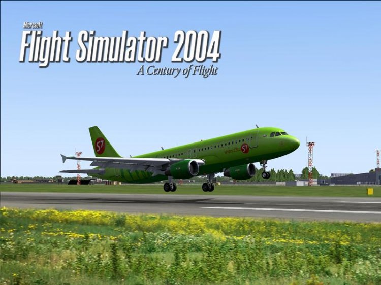
I wanted to draw a thread that simple but beautiful. Thanks to Denis Minaev for livery for Wilco.
→ Size:
641 KB
→ Date:
15 years ago (14.03.2011 03:13)
→ Author:
Максим Ессер AKA NCdancer
→ Approved by moderator:
Lenya69
→ License:
Freeware - Free version, Unlimited Distribution
→ Downloaded:
198 time(s)
+2
5
Well turned out) did the right thing, not painted frame)
− ryabov_912,
15 years ago,
#
+1
5
+
− nik-dem,
15 years ago,
#
5
Сплешка просто отменная! я лично соглашусь со словами raid-a. она действительно самая лучшая за последние насколько лет) удачи.
− малый,
13 years ago,
#
5
After a winter thing then
− Wlad90,
15 years ago,
#
4
standards
− kroll,
15 years ago,
#
5
The first great spleshka over the past few years avsime!! For photoshop and imagination - even PLUS FIVE! PS correspondence below posmeshila ...
− RAID74,
15 years ago,
#
Your koment no less amused ))))))))))))
− kroll,
15 years ago,
#
RAID74, thank you. will try to even better .=)
− NCdancer,
15 years ago,
#
5
Well Nitsche so cool) 5 can be supplied)
− UHWW,
15 years ago,
#
5
!
− Pilot_154,
15 years ago,
#
5
I liked it! Or you can do with Iksom?
− Yanchukoff,
15 years ago,
#
5
Simpotichno!
− wegass,
15 years ago,
#
In what sense? Sim sweats?
− КурсМП,
15 years ago,
#
This is from the series: "air tickets", "avioproisshestviya" ... :-)))
− lis73,
15 years ago,
#
This is from the series: "air tickets", "avioproisshestviya" ... :-)))
− lis73,
15 years ago,
#
but the fact that sometimes the letters are not the insert, then I basically forgivable-I by nationality POLE !:-)))
− wegass,
15 years ago,
#
-5
Picture, alas rather "boring" (in the text there is mention of the livery, but something in the screenshot, this picture is not very similar). The frame around the edges, probably would not stir. Well, that corporate logo, but the size might be too "firm" (quite fit would be). Generally, it is better to be based on the screenshots. There may be light from any side to do, and select the desired angle (on the strip since the photographer will not be allowed) and, especially, at 10000 feet up and from all sides - it is only in the simulator can be removed. Think ...
− Karadag,
15 years ago,
#
+1
Karadag, you may appeal to the eye doctor? I understand that DV Minaev draws high-quality textures, but do not distinguish the real from the A320 Vilkovskoy vizualki - this is serious! On the screenshot vilkovsky A320 and simovsky scenario, only the grass in the foreground inserted real! And if you have not noticed, it means huge respect to the author, his spleshkoy as he brought the symbol to the realities and your chetverochka looks silly, because set including a "real picture".
− ROCK_AVIA,
15 years ago,
#
Vain vain vain, very vain ... Spleshka out well here, not that there is any carbon that usually do)
− UHWW,
15 years ago,
#
* Which
− UHWW,
15 years ago,
#
+1
Karadag, thanks for the tip. had a good laugh = D
− NCdancer,
15 years ago,
#
+2
Grass is still stuck! A screen is still boring. Unwise such pictures with the shadow side to do. Inexpressive obtained. In S7 already rather dull design. And with the shadow side and does look bleak. However, if you really like, put yourself what you want. Just something not too many have downloaded. About the assessment. Here, the site's all a bit sick. In addition to 5 and 1, no other estimates do not recognize. Consider this work a masterpiece. Can put on a par with the visual model of vitamins? After the above five assessments have not! Spleshka actually quite weak. But, as previously there had been exhibited numerous completely helpless, "creation", then 3, I bet not. Rated 4, recall means "good." Well, not bad. If someone is not enough, should be treated by excessive pride and ego ..
− Karadag,
15 years ago,
#
Karadag, four against one does not have anything against, I personally do not appreciate this splash. But you put your four, and attributed this to several reasons, including the "real picture"! It follows from this that you put your estimate is not enough acquainted with the file ... But compared with a splash Vitaminovskoy vizualkoy as it is not correct - they are different categories of works: and in each category has its own sludge and their masterpieces, hence the rating. And among all the splash on Avsime, even with an estimate of five, this is clearly a cut above! And you put yourself silly, reducing the estimate for the actual photo, then another and tried to justify himself, saying that the grass is stuck ... And what a screen is made with the shaded side, in this case is a plus, because on the other side we have seen an enormous flare instead of texture C7! And here is not photographic competition, where you want to seem so carefully the pros!
− ROCK_AVIA,
15 years ago,
#
As some here a little heated and zaminusili "My first comment to the complete invisibility, you may not quite understand him correctly. Even though I took an edited screenshot of a mediocre photo quality images that did not change (by the way, for your information, I had already assessed quintet and spleshskriny based on the photo). I repeat, the picture is pretty boring. I certainly did not reduce the assessment of the perceived photobasis. I, on the contrary, increase the score by 1 point (should have been put 3). Increased because most spleshek there are no good at all, and that, thanks to the author, has another and logo. I repeat, if you personally really liked, put it to myself and enjoy them forever. And if you want to see a really nice screenshots, look at the relevant section of the forum. Something like this: http://www.avsim.su/forum/topic/84353-takim-nebo-viditsya-mne/page__st__20 Not all the screenshots, of course suitable for savers simulator, but in any case, they should be beautiful and expressive ...
− Karadag,
15 years ago,
#
Atte. Karadag, do not consider a boorish, but your comments like childish prattle. Some excuse. Let me ask you at least get the files? what is wrong with the quality? where cogent argument? and that with the fact that a screen shot with the shadow side? and that there is no scope? Nobody in the offense, I do not have ugazhdat each in their works. Do as I can, how to see my picture, but your task, SW. Karadag, just wanted to assess, evaluate the overall work without a mixture of your wishes. This can and ask for drugs. Do not like it, do better, and we will evaluate. I do not consider myself a pro, but I try to come to this. If you look at my first "job", the difference in the face. Once you have already made Slaubaugh, and that you? Tu-104 on a background of clear sky + logo and all ... Not to be pustoslovnym, http://www.avsim.su/f/fs2004-zastavki-splash-screens-47/tu-104-zastavka-dlya-fs9-29066.html let people compare. For this work, I'd have more than 3-ki did not deliver, given the demand for something "out of the ordinary." And about the logo at all shocked. For firms of course please, but it turns out, if you put three officially, but I choose a different font, then you would put a deuce? PS Of course the font would have been treated to the picture is not spoiled, but it's true, then do some ... After these comments there is only one issue, "the crown is not too tight?"
− NCdancer,
15 years ago,
#
Rudeness, it is rudeness. What here to apologize. Do not want anybody's advice. Will receive evaluation with no comments. In any case, your image fails. Pale and dull. Claim 5 in fact you have no grounds. Users months work by creating a model for a few days spent on the texture. We on this fly and deservedly put the highest mark. And how much work and talent invested in its creation are you? And is there any talent? You put "Well", gave a few tips and you're already in a rage. I'm afraid that you have something "pinched crown." Everything.
− Karadag,
15 years ago,
#
Karadag, and then you call a smile .= D, first, give some advice? I repeat only saw your wishes. weighty reasons for undervaluation in your comments was not and still does not. You're contradicting yourself. a picture can be pale and at the same time dull? GS nonsons just ... Secondly, judging by available estimates, only one among you all do not like spleshka. (Kroll does not count, it finally can not understand what he meant by his estimate. Then you .. tsya, felts for good reason). when putting the estimate below the 5-ki must be a reasonable explanation, not yours, no frame; pale and dull "and etc. ... I would have gladly accepted a robust criticism, but not delusional.
− NCdancer,
15 years ago,
#